Thursday, 15 December 2011
Evaluation: Question 2
How effective is the combination of your main
View more presentations from ezzabean.
This video refers to slide 3, as it the same voiceover used in both the documentary and radio trailer.
This video refers to slide 4, where I talk about the slogan we chose for our documentary and how we used it each of the advertisement products.
Video 3 refers to slide 5 where I talk about the channel 4 'ident' which is used in both the print advert and the radio trailer.
This video refers to how we have used the audio footage from the actual documentary itself, exported and then imported the footage into a new premire project and created our radio trailer.
Audio and Video Feedback
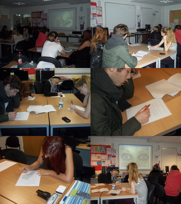
Thses are videos of audience feedback that I recorded on my iphone and uploaded to Facebook and Youtube...
Documentary Production: Screenshots of Editting in Adobe Premire Pro
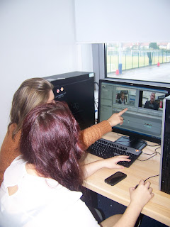
These are screenshots taken from the editting process of our documnetary and how we edited sound levels using sound key frames to ease music in from a high level to a low level when the voice over would start talking. but of also how we created the graphics of our title '40 Winks' and the names and relevance of our interviews across the frame when they would appear on screen.
This forst screen shot shows us editing the sound on our interview with Yvonne Harrison the Psychology lecturer from Liverpool John Moores University; and how we used snippets of the interview to include just the parts we wanted to include in our documentary with the help of cutaways to hide jump cuts inbetween these edits.
This screenshot shows how we created the graphics for our New Parents interview with Mark Vincent and our shift worker interview with Chris Ison, we chose the font and size and positioned it on the opposite site to were Mark was sat in the frame so it could be easily read and didnt interfere.
here we are editting a cutwaway of a clock so that it is slightly sped up and goes in reverse order. So we changed the speed to 120% and ticket the box to reverse speed.
In this screen shot we are cutting the clips of our archive footage down in order for it to fit into the required speaking time of the voiceover.
This screenshot shows our interview with Chris Ison the night shift worker at Network Rail, and how we are putting the cutaways of the trainstation over the jumpcuts of his interview. In order for it to run smoothly and sound smooth.
These are our voxpops and here we are simply cutting the parts that we want and putting them together.
This is our title which is featured at the end of our title sequence, we made this in the same way that we made the graphics for our interviews. But we used a different font and font colour.
These are the cutaways used in are beginning scene and title sequnce which shows a teddy bear which relates to what the voiceover is talking about and the man asleep on the couch is included in our title sequence.
This is a screenshot of us unlinking the captured footage and deleting the sound from the clip as we did not need the interference of sound clashing with the sound bed and voiceover. We did this with most of our footage and cutaways.
These are more of our cutaways that we have used in the final edit of the documentary, as it relates to what the voiceover is saying.
Wednesday, 7 December 2011
Newspaper Advertisement Production
These images show the production of our print advert and the ideas we went through experimenting to reach the main image we were looking for...
These images are screengrabs from the editing process of the Print Advert...
At this stage after taking the photograph and uploading the image into Adobe Photoshop, I began to create the print advert. I started with editting the redness of the eyes as when I was taking the pictures trying to make the models eyes red was virtually impossible as it just tended to make them more watery than red. As we tried rubbing the eyes but that hurt their eyes and made their eyesight blurry so they had trouble focussing at the lens of the camera removing the direct address to the audience. We also tried using an onion but again it just made the eyes water rether than turn red. And so came the editting, I drew around the eyes with the 'lasso tool' then selected image, adjustments, colour balance which gave me a window with scales where I could adjust the redness of the selected section. Which helped me achieve the redness of the eyes that I had in mind for the advert.
I then zoomed into each eye and in turn cloned each vein in the eye with the 'clone tool' and making the eye look even more tired by creating a stressed look with the amount of extra blood vessels present in the eye. I found that this helped create the eye to look even more tired, which was my main goal.
After that, I used the 'paint brush tool', set it at a size of 246mm and at an opacity of 9% to create dark circles around the eye; which again helped to create that tired, stressed look of th eyes we were hoping for.
This is a screen shot of how the eyes looked after the touch-up process.
After that, I now had to include the Channel 4 logo onto our Print Advert, which came to be a simple task made very difficult. Firsty, I tried using the 'background eraser tool' which was fast and simple with the click of a mouse but then I noticed that part of the logo had been earsed too which created a problem.
But I then used the 'Polygonal lasso tool' which meant I had to cut around the whole logo including the extra white parts that had been includied in the background of the original making of the logo, which took up a little extra time but with a patience it was still completed and put into the final production of the Print Advert.
I then simply dragged the cut out image across and onto the Print Advert and positioned the logo in the bottom right-hand corner, following the codes and conventions of a Channel 4 Print Advert.
This is now halfway through the production of the Print Advert, this image shows the creation of the text that is featured on out advert. By using the 'text tool' I created a text box to include the words; '40 Winks' another to iclude the slogan; 'HAD A GOOD NIGHT'S SLEEP?' and a final to include the words for the scheduling; 'Wednesday, 8.30pm, Channel 4'. In a white font called Myriad Pro. The images below show the other writing being made and the black boxes behind the font using the 'rectangle tool', following the ocdes and conventions of a Channel 4 Print Advert.
This shows the finsihed Print advert, including the slogan ' HAD A GOOD NIGHT'S SLEEP?'.
Subscribe to:
Comments (Atom)


